

This Tier List Tuesday we are covering Vintage NFL Logos and I decided to list them in 5 different tiers. Those tier’s ranging from top to bottom are “BRING IT BACK”, “Pretty Good”, “Different Enough” and our bottom tier, “Racism”. I think these tiers are simple enough and don’t need more explanation so let’s dive right in! I will also put my favorite logo from each tier at the end of each explanation.
“Racism” Tier
This one consists of only two logos and they have both thankfully changed (Kinda). Those teams are the Chiefs and the old “Redskins” logo. These are both just offensive and it’s for the best that they changed the logos and some of the names. The only name that they never changed was the chiefs stadium. It’s still called arrowhead which could be a lot worse. Let’s take the slow strides and be thankful that we no longer have the redskins. There really isn’t much else to say about these racist teams. So let’s move on.
Favorite: No one has a favorite racist symbol so I won’t be picking one.
“Just The Same” Tier
This tier is filled with teams that are extremely similar to their current logos or its ones that they use often and not sparingly. Take the Giants, Saints, Jags, Lions and Panthers. They are identical. There really isn’t much that makes them different enough or cool enough to feel like they belong higher on the tier list. Then we also have logos like the Seahawks, the Cowboys and The Bills. Obviously these are very similar to logos that these teams often use and really don’t deserve to be rated highly on this list. Compared to some of these other logos this one is really tame and weird so they all get a big thumbs down from me. Let’s keep it rolling.
Favorite: 
“Different Enough” Tier
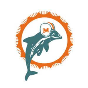
This tier is some of those vintage logos that we see sometimes. For example, the Jets bring out that logo and the Titans play as the Oilers every now and then. This tier also has some of the classic logos that people love, understandably! Examples of those are the old Eagles logo, which Philly seems to love, the old Bengals logo, which unironically goes very hard, and finally the old dolphins logo. This logo is infinitely better than they’re current video. Think about it. When you look at the current dolphin’s logo you really can’t tell if it’s a sports logo or a shitty fast food place on the side of the Florida Interstate. BUT WHEN YOU SEE THAT OLD LOGO YOU JUST KNOW THAT DAN MARINO WAS GOING TO THROW FOR 4 TOUCHDOWNS AND 400 YARDS. Another logo that brings back similar feelings is the classic Ravens logo but replace Dan Marino with Prime Joe Flacco. These Logos are some of the best what I like to call “Neo-Classical”. It reminds me of my childhood when the Jets were actually good.
Favorite:
It really is one of my favorites but like it may not hold up to the top tiers but it still is top tier
“Pretty Good” Tier
This tier has some of the better classic tiers and it really makes you think, “Why did they change their logo?”. Let’s take a look at some of those. The Browns logo is the best example because they had the little elf guy and although I have no idea what that has to do Cleveland but by god I love it! The old colts logo is another example of this because rather than the stupid horseshoe they had had a bad ass bucking horse. The league has gone too much towards these ugly ass corporate logos which is sad to see. The other level of logos that we have in this tier is the logos that are very similar to what they use now but just done kinda cooler. The Rams and the Raiders are perfect examples of that. It’s just something about these less perfectly rounded logos that gives them charm and I’m here for it.
Favorite:
“BRING IT BACK” Tier
This tier is kinda self explanatory. These are the best of the best classic logos. The old Buccaneers logo, the old Pats logo and the old 49er’s are all vintage looking but also look like they could be used today. They seem to tow the line between really old school and artificial old school. The difference between those are really old school is something that actually existed back in the day vs artificially old school being created now to look as if it’s vintage. But these somehow have the staying power and still rock today. My favorite was a toss up between three. The old Bears and Packers logos were very close to being on the top because they seem like actual logos that I would wear in real life but I had to narrow it down to one it really wasn’t that hard.
Favorite: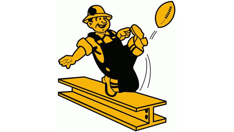
That’s the list and if you have issues with it please send me your list or tell me what you would change. I am always looking for things to list so if you have any suggestions please let me know!

Leave a comment